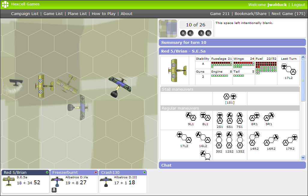
I have taken a slight detour from working on campaigns to rework the game interface again.
Version one of the interface was tall and had to be scrolled to see everything. In version two I put everything onto one screen without scrolling but elements of the interface overlapped and obscured one and other.
With this third iteration I am putting everything on one screen but having nothing overlap. The interface will take up all of the available screen real estate, so if you have a high resolution screen then you will benefit from your extra pixels. That said I have been testing in a 1024×768 screen to ensure it is usable at that size.
I also plan to do away with the two different versions of the game. Old games still use the version 1 interface, while later games use version 2. This is more than just a cosmetic difference. The way in-game messages are recorded in the two versions is different. I plan to merge those different sets of messages into one. With the messages merged I can then go back to having a single code base.
And that is the whole point. I am trying to simplify and clean up the way everything is coded so I can take the next steps with the campaign coding.
I am also trying to get a coherent visual style through the site. Development has been iterative and each iteration has left a legacy of visual styles. In designing the new interfaces for campaigns and pilots it became clear that some house cleaning was in order.
Have a look at the new screen shot and let me know your first impressions. I hope you like what you see. Leave a comment.


Interesting! The minimap allow us to scroll the map?
Yes. Eventually I want to add dots to the mini-map showing the locations of the plans.
Wow, i’ve noticed now: the Chat!!!!!!! XD